Why the More Tools You Use, the Less You Produce
Apr 15, 2026
Why the More Tools You Use,
the Less You Produce
You're not behind because you lack the right app. You're behind because nothing you're using knows what the others are doing.
You have the apps. You have the subscriptions. You have the prompts saved somewhere in a note you barely open anymore. And yet the work still takes forever, the outputs still don't match your brand, and every new project feels like starting from scratch.
That's not a tool problem. That's an architecture problem. And until you see the difference, you'll keep adding tools to a system that was never designed to work together.
"Every time you open a new app and explain yourself again, you're not creating — you're managing confusion."
Here's what's actually happening. Every tool you use operates in isolation. It doesn't know your brand. It doesn't know your standards. It doesn't know what you made yesterday or what needs to happen next. So you become the connective tissue — the person who holds all the context in your head and re-explains it, every single time, to every single tool.
That's where your time goes. Not into creating. Into managing the gap between what each tool knows and what it needs to know.
The Real Cost Nobody Is Talking About
Think about the last time you tried to create something with a consistent brand look. Maybe it was a set of social posts, a series of images, a content campaign. You opened one tool for design, another for copy, another for scheduling. You explained your brand colors here, your tone there, your layout preferences somewhere else.
And even after all of that — the result still felt off. So you revised. Then revised again. Then abandoned it and simplified.
What you experienced wasn't creative failure. It was a system charging you twice — once in time, and once in creative energy — for work it should have already known how to do.
I know this because I lived it. For months, I was bouncing between apps trying to maintain a consistent brand look for my own content. Learning safe zones. Managing color standards. Trying to keep everything aligned so it actually looked like it came from the same place. Every piece felt separate. Every update meant going back, checking, redoing.
Then something changed — not the tools, but how I gave them something to work with.
What Actually Changed Everything
I started learning from Jake Van Clief's free Foundation course at Clief Notes on Skool. His framework taught me something I hadn't seen explained clearly before: the problem isn't prompting, it's architecture. Specifically, how you structure the environment your AI works inside.
Instead of explaining everything every time, you build three simple markdown files that tell the AI everything it needs to know — once. Then it knows. And it keeps knowing every time it enters your project.
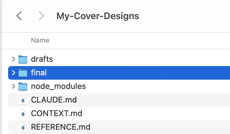
Three files. Plain text. No code required. This is the entire system.
Layer One
CLAUDE.md — The Map
This file sits at the root of your project. Every time Claude enters your workspace, it reads this first. It's the floor plan — where things live, how the project is organized, what tasks go where, what to read, and what to skip.
Without it, the AI wanders. It reads too much, loads too much, and guesses at what matters. With it, it routes directly to what's needed. That routing alone eliminates an enormous amount of hidden waste.
Copy and paste this into a file and title it: CLAUDE.md
# GabeYoga — Reel Cover Design System ## Task Generate a PNG reel cover image at 1080×1920px using the brand system below. Use Node.js with sharp + embedded Inter font for reliable, pixel-perfect output. ## Brand Constants Background: #F5F0E8 (warm cream) Headline: #1A1A1A (near black) Accent: #B5731A (amber) ## Typography Font: Inter (must be embedded) Category label: 36px, weight 700, letter-spacing 8px, UPPERCASE Headline: 148px, weight 800, letter-spacing -2px Subline: 52px, weight 400, accent color ## Safe Zone All content must stay inside 15% inset on every edge Left edge: x=162px — Right edge: x=918px Top safe: y=230px — Bottom safe: y=1690px ## Variable Fields (only these change per cover) CATEGORY: Yoga Coaching / Breathwork / Adjustments / Sequencing HEADLINE_1: Your cues HEADLINE_2: aren't HEADLINE_3: working. SUBLINE: Here's what does.
Layer Two
Context File — The Environment
Each workspace has its own context file. When Claude is in the Writing Room, it reads the Writing Room file. When it's in Production, it reads the Production file. It only loads what it needs for where it is.
These aren't technical documents. They're plain English — a few short paragraphs that describe what this space is for, how it works, what the process looks like, and what tone and standards apply here.
The result: instead of re-explaining your brand, your voice, your process every single time, the project already contains all of that. You say "go to the Writing Room, let's build something" — and Claude reads the context, understands the space, and just asks what you want to make.
# GabeYoga — Cover Context ## Goal Create reel covers that are instantly readable, visually consistent, and scroll-stopping on mobile. ## Core Principle Clarity beats creativity. If it's not readable in 1 second, it fails. ## How to Build a Cover 1. Start with the message — what is the viewer already feeling? 2. Reduce to essentials — 3 headline lines, 1 subline (max 6 words) 3. Follow exact layout from SYSTEM.md — do not move elements 4. Optimize for mobile — headline must dominate ## Writing Rules Use simple, direct language. Avoid abstract or "yoga-style" phrasing. Prioritize words people already feel. ## Output Instructions 1. Read the topic or reel description provided 2. Generate: CATEGORY, HEADLINE_1, HEADLINE_2, HEADLINE_3, SUBLINE 3. Inject into SVG template from SYSTEM.md 4. Output production-ready PNG at 1080×1920px
Layer Three
References File — Where to Look
This is where your resources live. Brand colors. Design rules. Skills. Code snippets. Schematics. External resources. Anything Claude might need to navigate to during the work.
The power here is navigation. Claude doesn't have to ask you where things are, and it doesn't have to guess. It knows that if it needs the color palette, it's in references. If it needs the design skill, it's there too. It goes directly to the resource without burning tokens wandering around your project.
This is also where you connect plug-and-play capabilities — specific skills wired only into the workspaces where they're actually needed. Production might reference a design skill and a text-to-video workflow. Writing might reference a humanizer skill. Each workspace stays fast and clean.
# GabeYoga — Cover Reference ## Brand Feel Apple-like restraint. Nothing extra. Nothing decorative. ## Headline Patterns That Work Contrast: "You're trying too hard." / "Do this instead." Interrupt: "You're not breathing." / "Not really." Problem: "Your cues aren't working." / "Here's why." Reveal: "Most teachers miss this." / "Every class." ## Subline Style 3–6 words maximum. Moves the viewer toward watching. Feels like a payoff, not a description. ## Words That Work Use: "aren't working" / "changes everything" / "here's why" Avoid: "could be better" / "makes a difference" / "let's explore" ## Success Check Understood in under 1 second. Felt immediately — not just read. Compelling — makes you want to watch.
What Happened When I Built This
Before this system, my Instagram @Gabe_Yoga channel looked scattered. Every image felt disconnected. I was spending hours managing consistency that should have been automatic — juggling safe zones, brand colors, typography rules across multiple apps, never quite getting it right.
After building the three-file architecture and giving Claude the brand standards through the reference file, I gave it one simple prompt.
Thirty images. Under an hour. Consistent. Branded. Done.
No multiple apps. No back-and-forth. No re-explaining standards every session. Claude understood the brand completely — because the architecture told it everything before the first prompt was even typed.
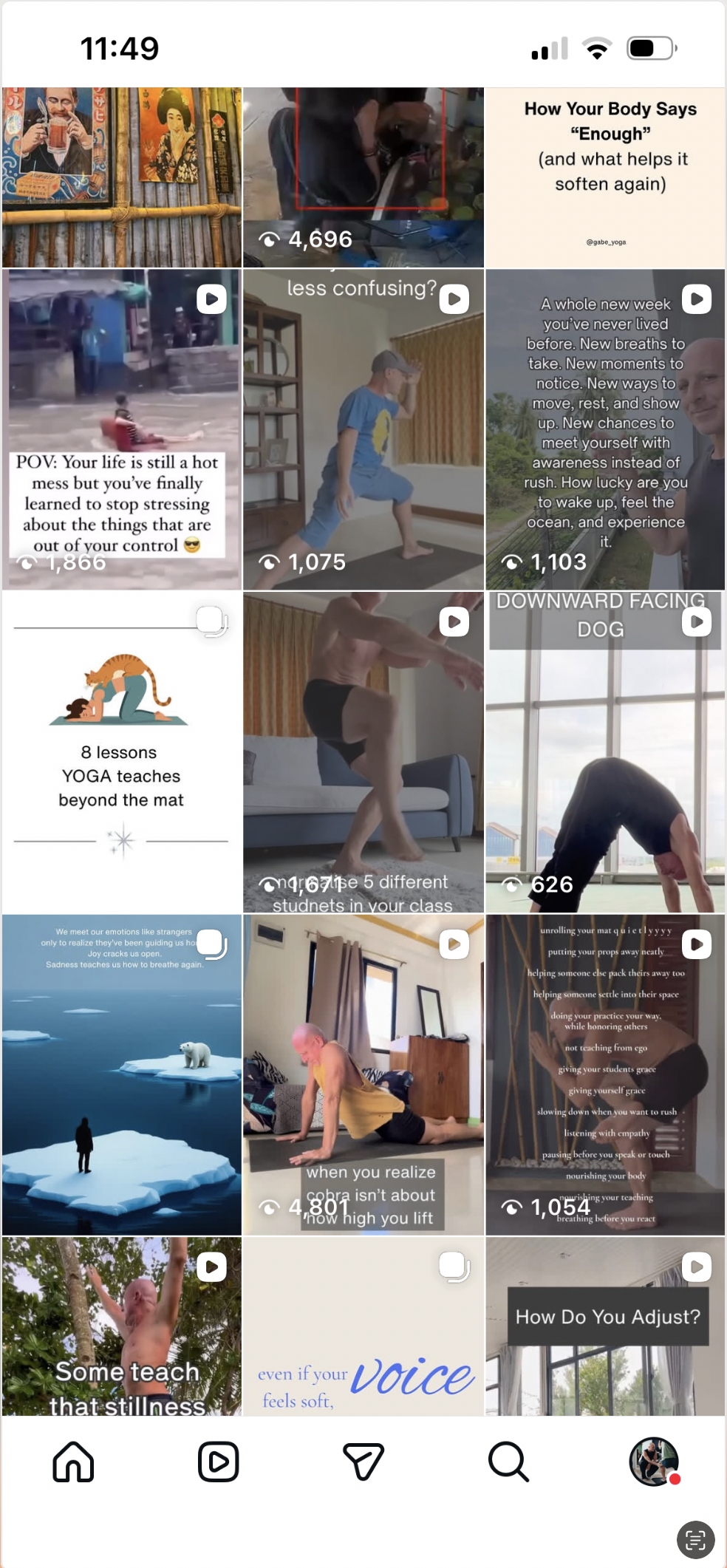
Before — fragmented, inconsistent, hours of manual work per image
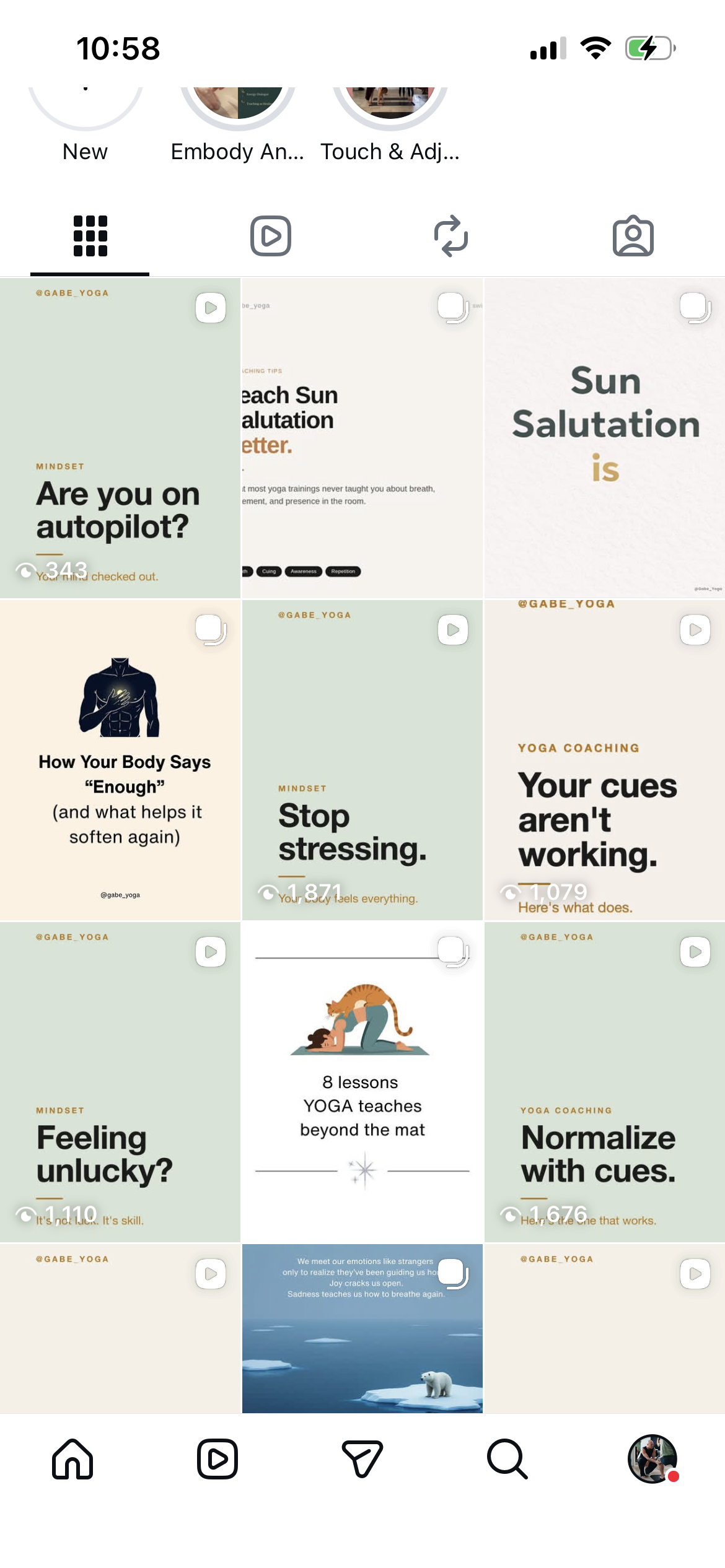
After — 30 branded covers, under one hour, produced by Claude Code with a two-word prompt
The Simplest Way to Say It
You don't have a tool problem. You have a structure problem.
Right now, you are the connective tissue in your own workflow. You hold all the context. You re-explain it every time. You pay for that confusion in hours and money, every single session.
Three markdown files remove that tax entirely. A map that tells Claude where to go. A context file that tells it how to behave in each space. A references file that tells it where to find what it needs.
That's the whole system. And once it's built, you stop managing the AI — and start directing it.
"Creation time from days to minutes isn't a prompt trick. It's what happens when the system stops guessing."
Where to Start
If you want to learn the full framework from the source, start with Jake Van Clief's free Foundation course at Clief Notes on Skool. That's where I learned this, and it will reframe how you think about working with AI entirely. The course is free. The Foundation module is where everything in this article comes from.
If you're already using Claude Code and want to understand how to adapt this architecture to your specific creative workflow — reach out. I'm happy to share how I'm applying this in practice.
Learn the Full Framework Free
Jake Van Clief's Foundation course at Clief Notes teaches the complete three-layer architecture — folder structure, context files, routing logic. Free. Practical. It works.
Visit Clief Notes on Skool →